
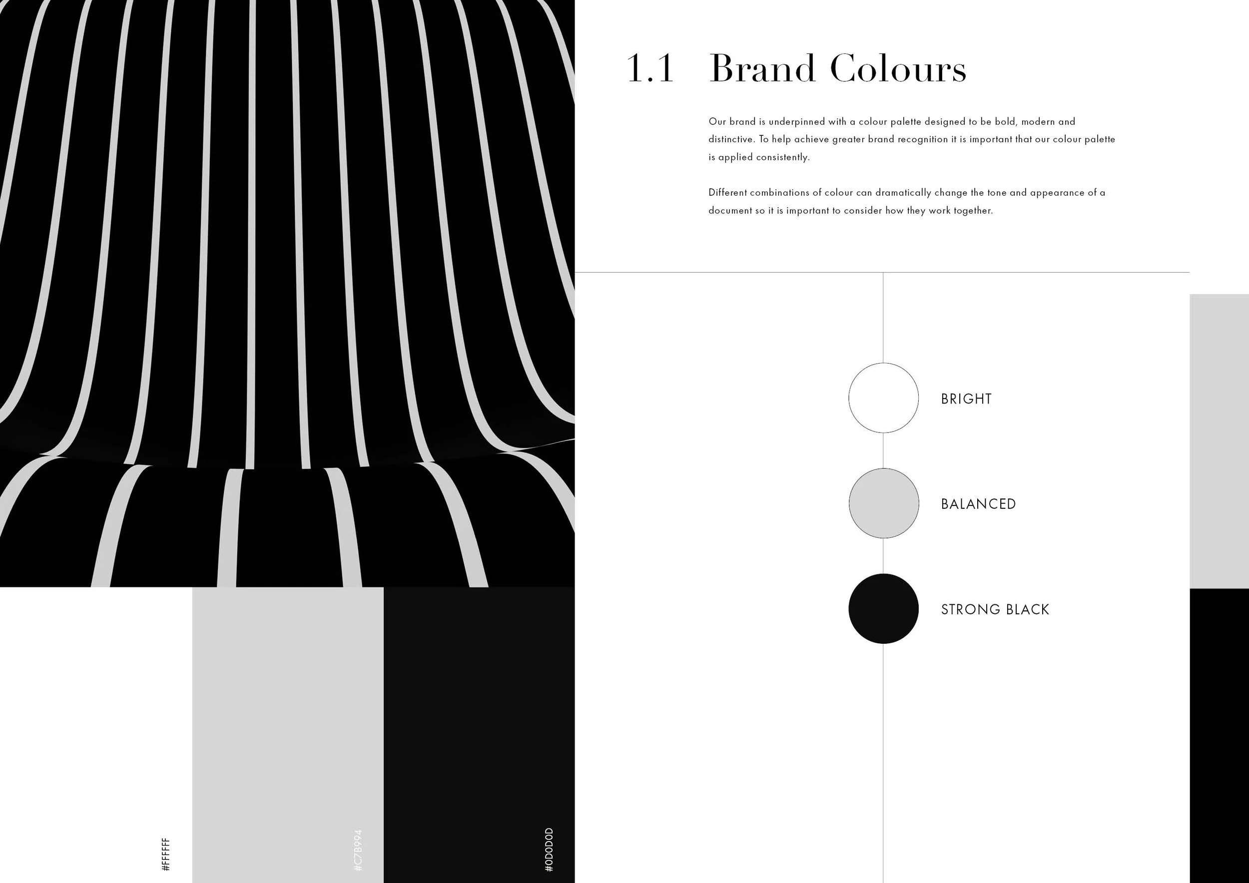
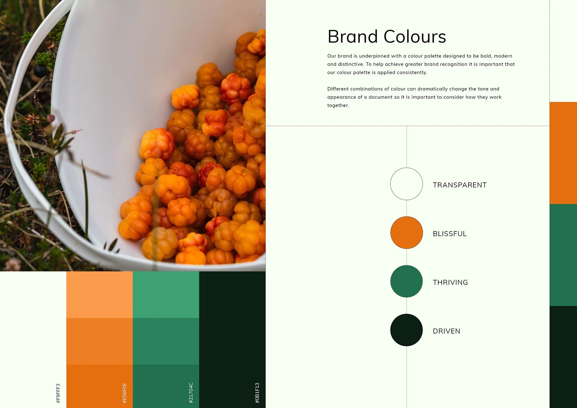
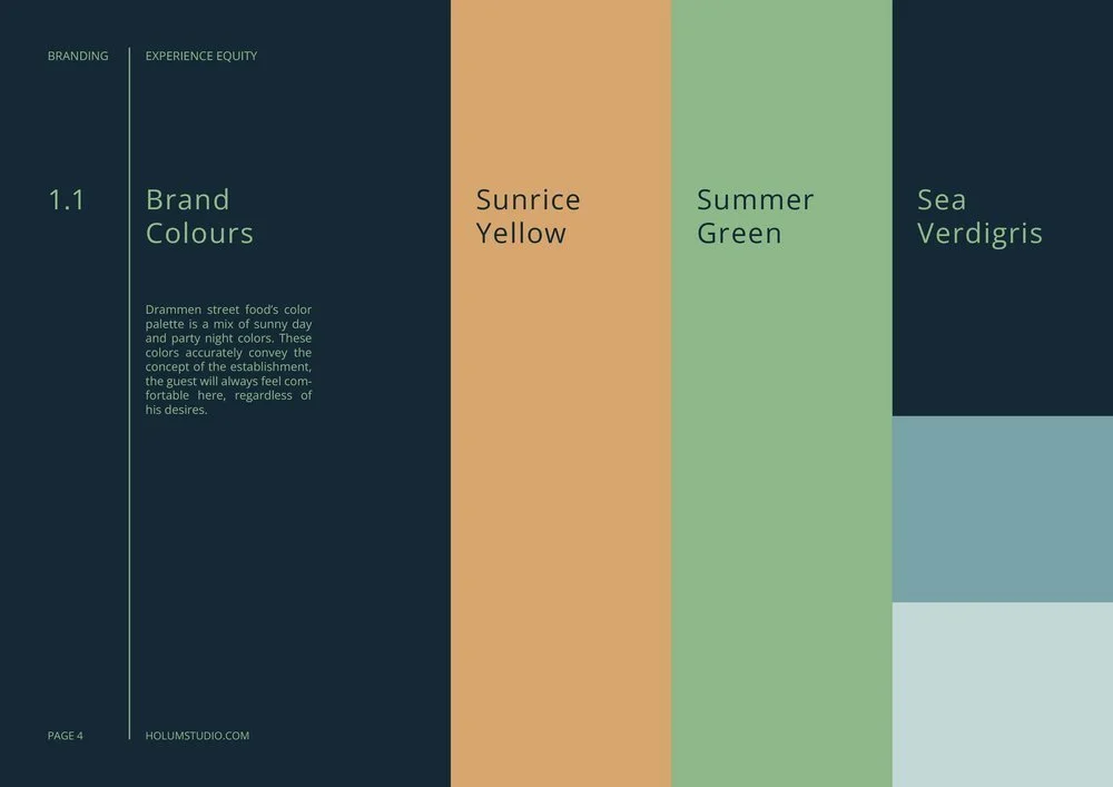
Brand Colour Palette
Explore the 4 main types of brand colour palettes:
Monochromatic / One Colour
Anachromatic / Black & White
Complimentary / Two Contrasting colours
Triadic / Three Colours
01 Monochrome Palette
One colour, several tones and hues, from bright levels to dark, well suited for professional services such as Finance, Lawyers or Technology based companies.
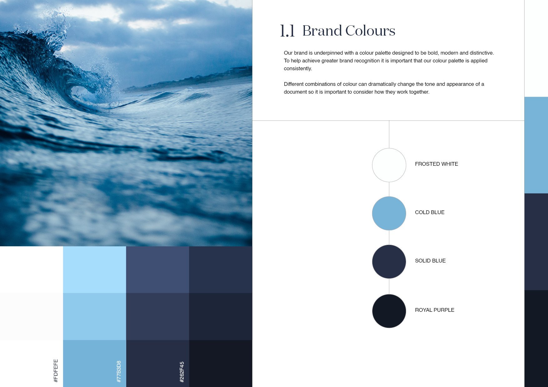
A monochromatic color scheme is a one-color scheme that is created using different tones of that one color. Once you have chosen your base color, you can use a colour wheel to help you choose different hues of that same color, varying the saturation and tone of the base color to pick out lighter and darker hues. Monochromatic color schemes are easy to create but look dramatic because of their use of a single color. The monochrome you choose will largely depend on your preference for that single color, since you can choose warm, cool, light or dark shades to suit your room's orientation, daylight, size, shape and mood.
02 Black & White Palette
A timeless classic, creates a sense of sublime elegance. Frequently used by Art Museums, High End Fashion, Design Studios and Architects. Brands to mention Apple, Uber, Samsung, Prada.
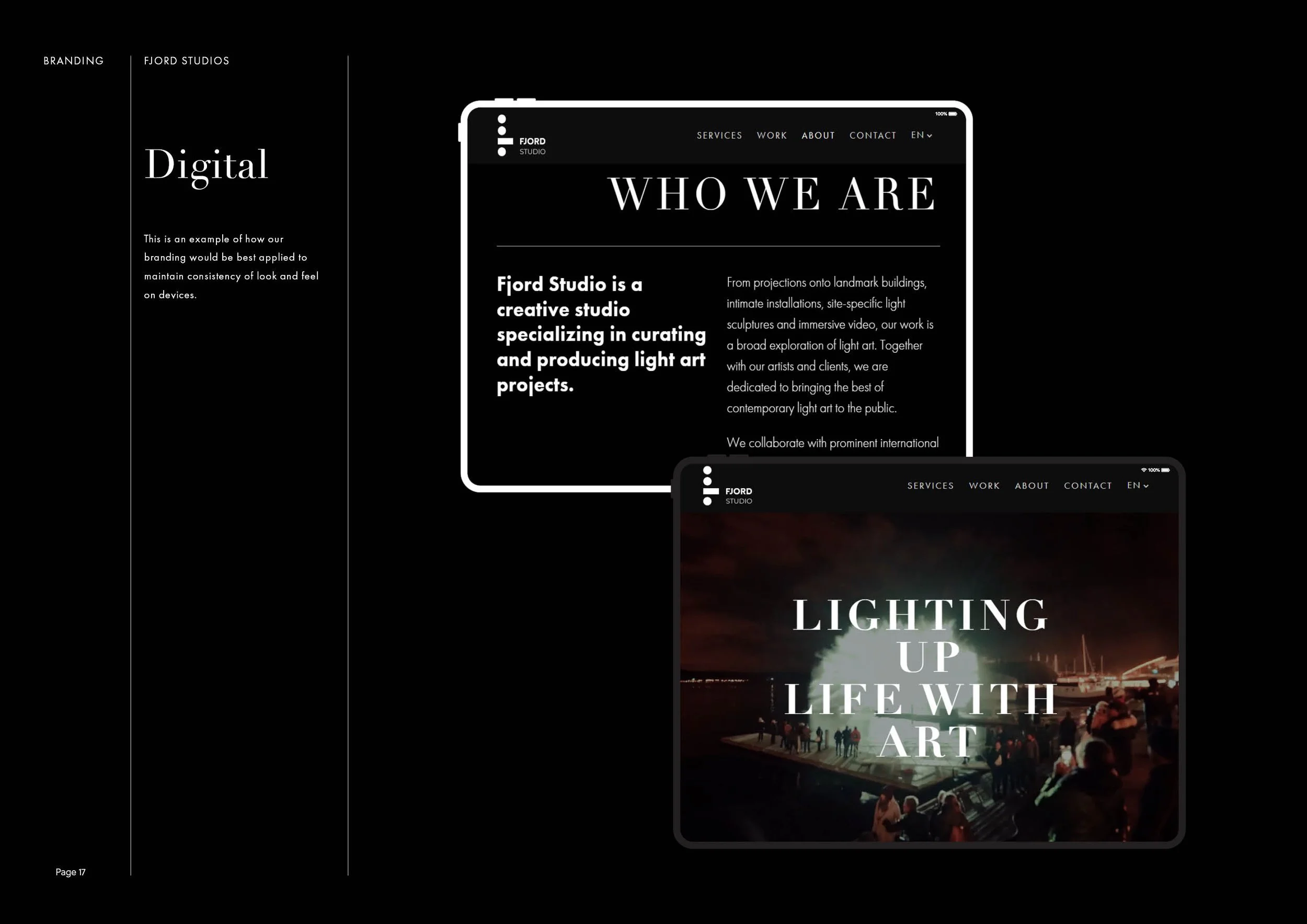
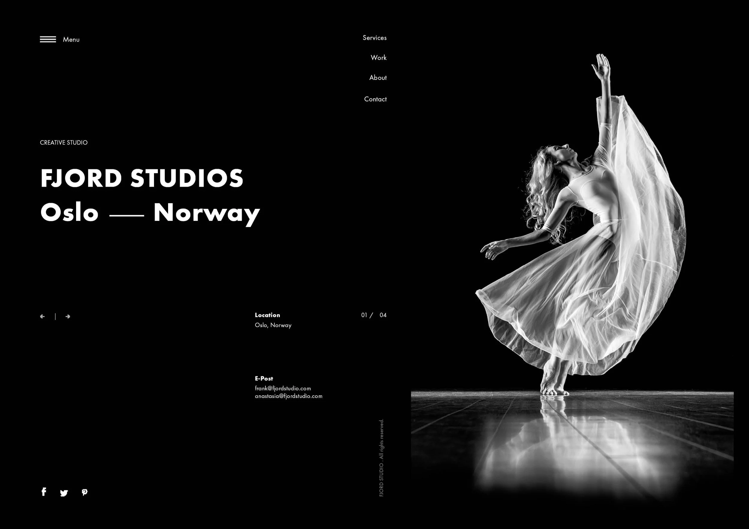
Are you breaking your head over how to create a timeless branding that won’t look outdated in a few years? Are you looking to bring forward your product value or emphasize the unique personality of your brand? One way to go is to benefit from a black and white branding color scheme. In this article, we’ll examine how to make the most out of a black-and-white palette wisely and where to look for inspiration. The striking union of black and white can add depth and volume to any design, which is paramount to drawing the viewer’s attention. Achromatic designs stand out through their edgy and refined look. It’s for a reason that black is the second most popular color used by the Fortune 500 companies in their branding.
03 Complimentory Contrast Palette
Contrasting colors are colors that differ from one another. Levels of contrast vary from high to low, depending on their position on the color wheel. For example, colors that are directly opposite one another on the color wheel have the highest contrast possible.

Designers have the opportunity to keep things homogeneous; fonts, elements, layouts, and sizing could all stay consistent and the world wouldn’t end. But that’s not how design works – we’re trying to make things different, stand apart, and say “look at me!” So, we learn about font pairing, we use multiple elements, rework our layouts, and resize and realign our content to make things more interesting and accessible for the viewers. Color contrast is another element that designers play with not only for aesthetic effect but overall accessibility.
04 Triadic Color Palettes
If you genuinely want to create something remarkable, then choose a triadic color palette. These palettes are made from three colors at equidistant points. For instance, red, yellow, and blue.
This is where you go gaga over the colors and come up with an exceptional and lasting palette. However, keep in mind that you’d have to do a lot of experimentation and sampling to get the right colors together. Do you ever wonder if the colors around you have a meaning? Think about it; why do you feel more passionate about the color red? Well, you might be pleasantly surprised to know that colors radiate energy. This energy is essentially the vibe of the color that can impact your mood.